Post-Apply Verification
Reducing Abandonment in a Fragmented Journey
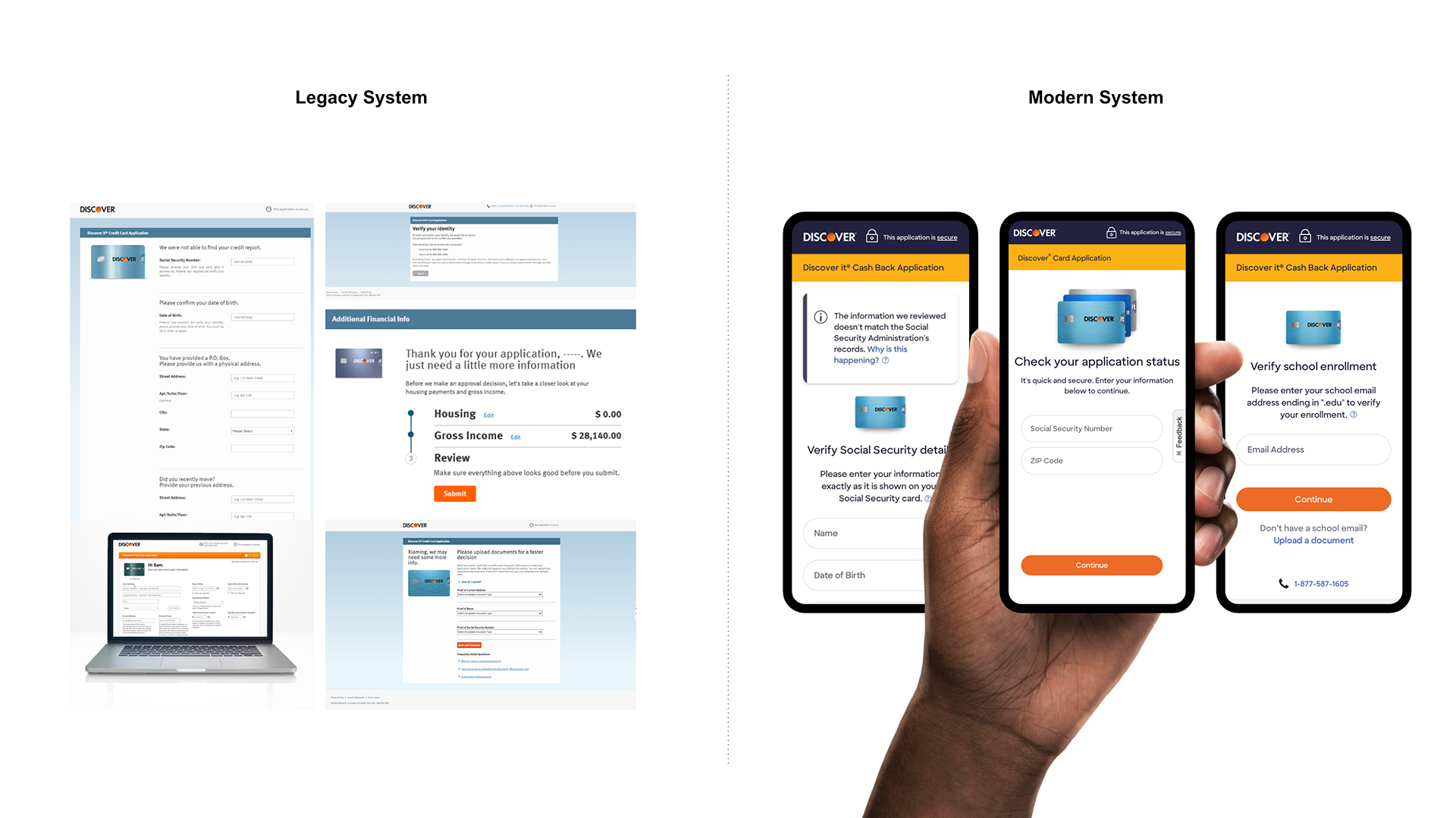
Identity verification disrupted a critical moment in the credit card application journey, where customers expected an approval decision but were instead pushed into a fragmented, high-friction process. Nearly 1 in 5 applicants abandoned when asked to upload documents, increasing both prospect drop-off and operational overhead.
I led UX strategy to redesign this experience, aligning product, risk, fraud, operations, and engineering around a more cohesive, in-session verification model that reduced friction while preserving compliance and risk integrity.
CLIENT: Discover Financial Services, Card Acquisition & Digital Servicing
MY ROLE: Strategy & UX Design Lead
KEY WORK: Executive workshops, system and process mapping, cross-functional alignment, service blueprinting, prototyping, and usability research
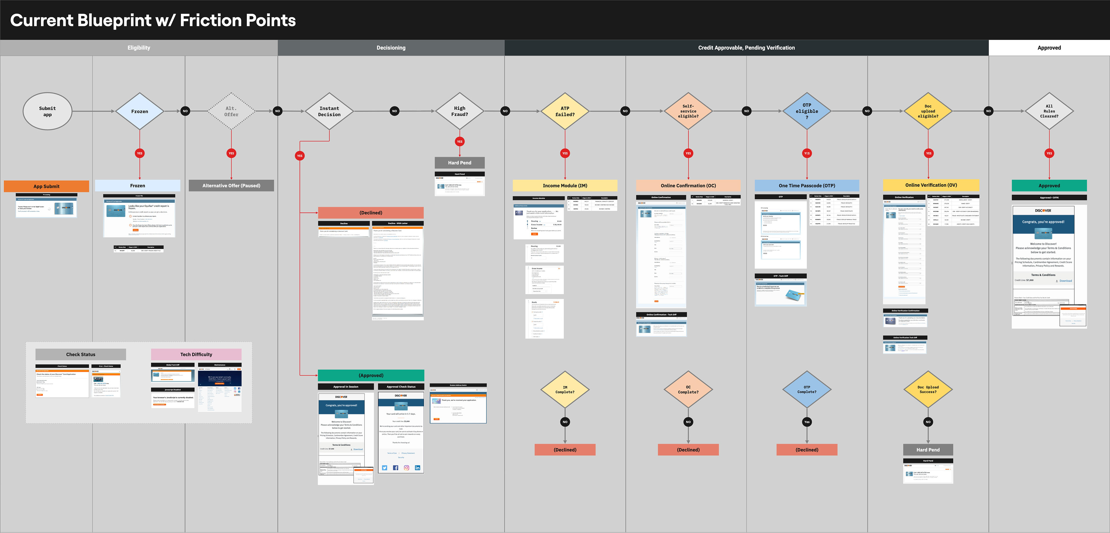
Current State Blueprint identifying logic, sequencing, and constraints for deep-dive work sessions.
CHALLENGE
Many Systems, One Applicant Experience
The problem wasn’t just poor messaging or outdated screens. It was a fragmented, legacy system. Multiple backend systems triggered verification checks independently based on risk signals. In isolation, they worked. Together, they created an inconsistent and unpredictable experience with no clear path for applicants.
I led the effort to untangle this system, mapping how these processes intersected and identifying where the experience broke down. From there, I defined a unified verification model that brought structure to the flow and enabled a consistent, scalable applicant experience.
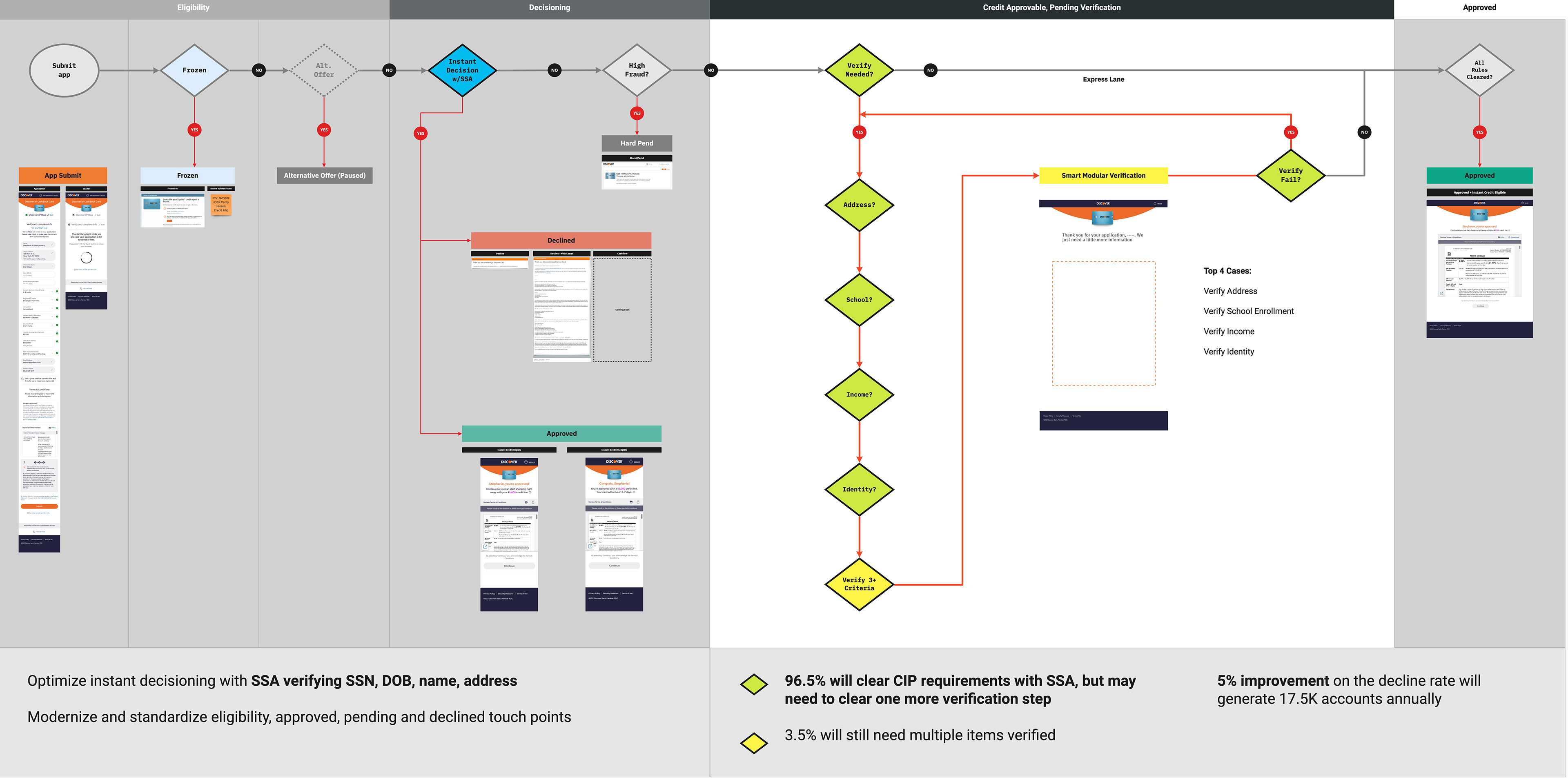
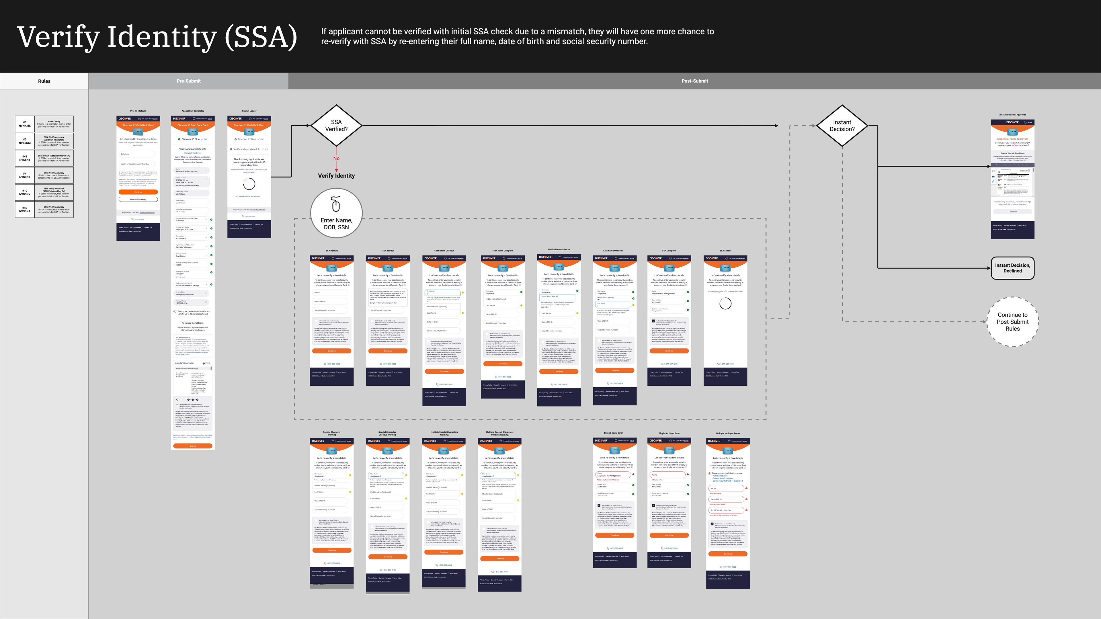
Early-stage logic flow model exploration to simplify, modernize, and optimize the verification platform.
APPROACH
Visualize Systems and Critical Paths
I started by making the system visible. I led the effort to map the full verification ecosystem, bringing together fragmented rules, system dependencies, and operational workflows into a single view. What emerged was a disconnected system where inconsistent logic across teams and platforms was driving unpredictable decisions, user confusion, and operational inefficiency.
I then aligned cross-functional leaders around a more cohesive model. A key tension was balancing consistency with edge-case handling, as the system had accumulated exceptions that introduced variability in how verification was applied.
I made a deliberate decision to prioritize consistency, standardizing the majority of verification scenarios and limiting exceptions to clearly defined cases. This reduced variability, simplified the experience, and created a more predictable system for both users and internal teams, while still meeting compliance and operational requirements.
The result was a future-state service blueprint that gave teams and leadership a shared model of how different systems were interconnected across critical paths, enabling aligned execution and more consistent decision-making across the experience.
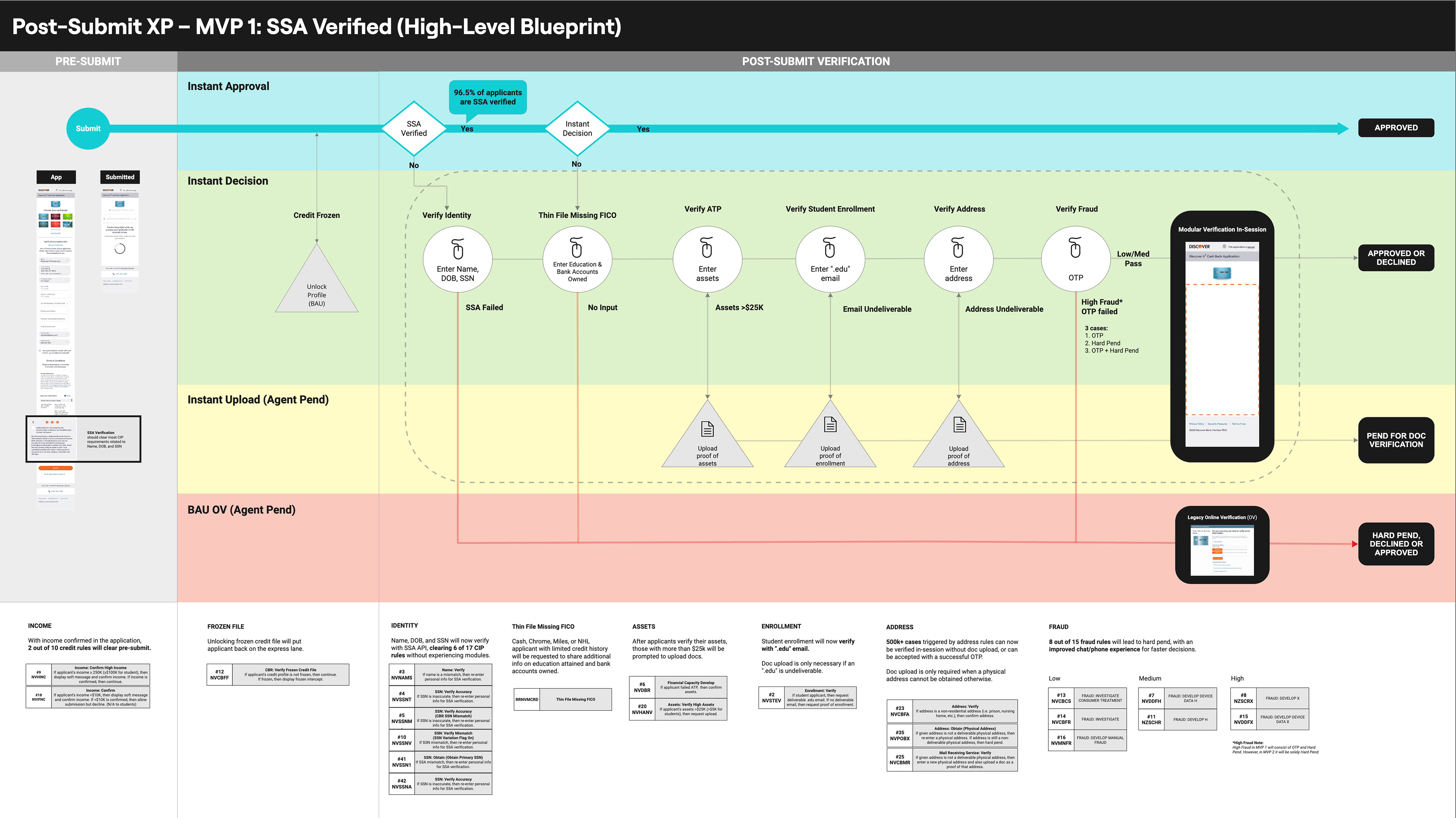
Future-state blueprint model created to illustrate swimlanes and review rules affected by modernization.
INSIGHT
Shift Expectations
Using the service blueprint as a foundation, I led the development of mobile-first prototypes to evaluate how applicants understood verification requests and document uploads.
Testing revealed a critical expectation gap. Applicants believed the process was complete after submission, so when verification appeared, it felt like an interruption rather than a continuation of the application. This misalignment led to disengagement at a key moment in the journey.
I reframed verification as a continuation of the application rather than a separate step. This required clearer upfront communication, more transparent reasoning for additional information, and eliminating redundant requests where users were asked to provide information they had already submitted.
By aligning the experience with user expectations, we reduced confusion, rebuilt trust, and created a more coherent and predictable verification flow.
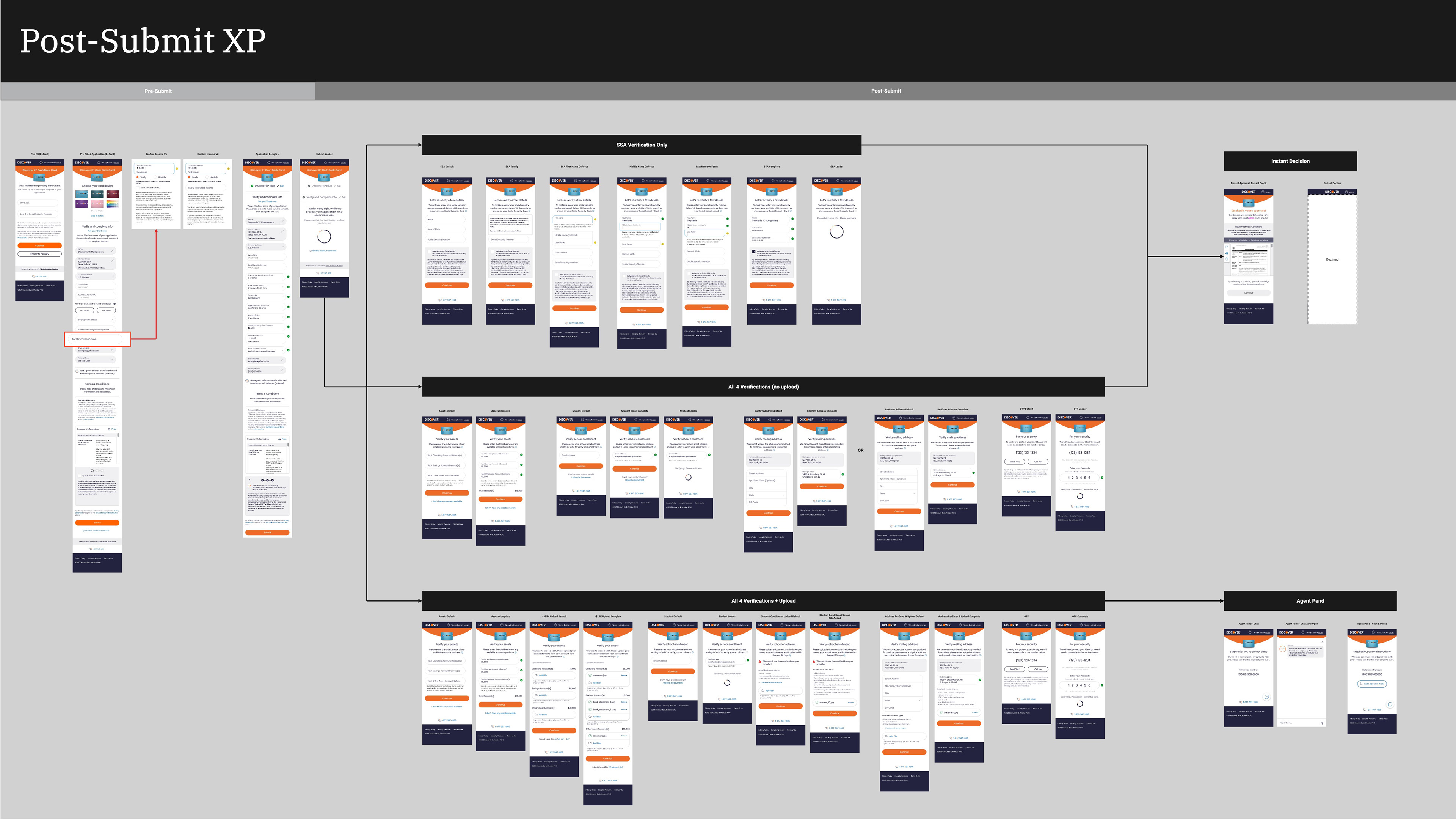
Wireflow visualization of 3 main verification scenarios based on performance data and path analysis.
Example stakeholder work session artifact to align on impact, tradeoffs, and intended experience design.
SOLUTION
Unified Experience
I defined a unified verification model that positioned verification as a continuation of the application, not an interrupting error state. This shift created a consistent structure and clearer messaging, helping applicants understand why additional information was required and what would happen next.
I consolidated fragmented flows with a single framework that improved error handling and introduced more meaningful feedback during document uploads. The experience was designed to be predictable and consistent, so when issues occurred, applicants could understand and recover without confusion or unnecessary repetition.
This approach allowed the system to manage backend complexity without exposing it, creating a more controlled, coherent experience.
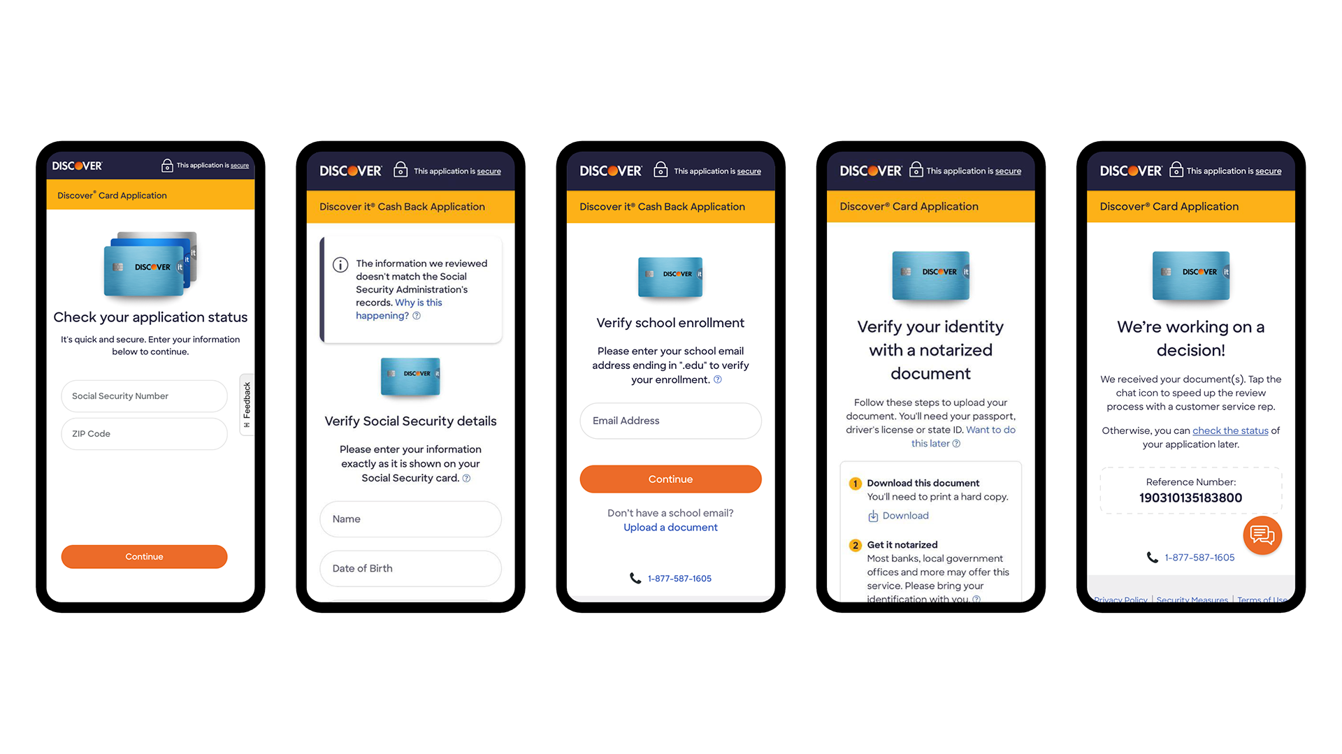
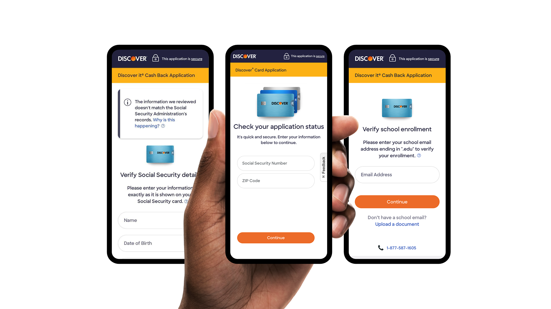
Key Verification Screens: Check Status, SSA, School Enrollment, ITIN Doc Upload, Pending Status
RESULTS
What This Work Changed
This work transformed verification from a fragmented, drop-off-prone process into a streamlined, in-session experience, allowing applicants to complete verification as part of the application rather than being pushed into disconnected follow-up steps.
I consolidated legacy flows into a single, scalable framework, making the experience more predictable, reducing confusion, and eliminating unnecessary repetition.
This created operational clarity across teams. By aligning stakeholders around a shared verification model, we reduced variability in case handling and established a repeatable UX pattern for future onboarding and compliance initiatives.
As a result, abandonment decreased, servicing call volume declined, and more applications were resolved within the same session due to improved verification logic and fewer unnecessary document requests.
REFLECTION
Designing with AI,
Leading with Judgment
Leading with Judgment
This work required bringing clarity to a complex, fragmented system and aligning teams around a shared model. System mapping, service blueprinting, and cross-functional workshops made that possible.
AI tools would accelerate parts of this process today, from synthesizing system rules and edge cases to speeding up prototyping and testing cycles.
But the hardest part of the work remains the same. Defining a cohesive verification model required making tradeoffs, prioritizing consistency over isolated optimization, limiting edge-case variability, and simplifying how the system is presented without exposing unnecessary complexity.
AI can increase speed, but it does not replace judgment. Aligning teams, establishing clear principles, and guiding decisions toward a coherent, scalable system still depend on leadership.
NEXT UP
Discover Card Application